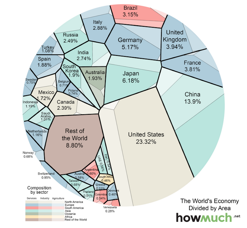
The World Economy in One Visualization
Today’s data visualization is the most simple breakdown of the world economy that we’ve seen. Not only is it split to show the GDP of dozens of countries in relation to one another based on size, but it also subtly divides each economy into its main sectors: agriculture, services, and industry. The lightest shade in each country corresponds to the most primitive economic activity, which is agriculture. The medium shade is industry, and the darkest shade corresponds to services, which tends to make up a large portion of GDP of developed economies in the world economy.
 The Global Economy’s Future Depends on Africa
To take it one step further, the visualization also shades the countries by continental geography, to easily see the relative economic contributions of North America, Europe, South America, Asia, Oceania, and Africa.


